Logo
DesignCritiq

Checkout Flow v2

Complete
May 26, 2026 SaaS · Pre-launch B2B buyers, 30–50
Re-run
78/ 100

Clarity Score: 78

Good

Your design is in good shape — no critical issues found. The primary area to address is visual hierarchy around the CTA. Resolving the 2 HIGH findings will likely push this above 85.

Target: 85+

5

Total Findings

0

Critical

3

Principles Evaluated

+24 pts

vs. Previous Version
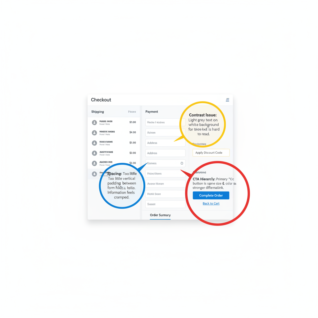
Annotated Preview5 annotations
100%
Checkout flow UI design with annotated critique hotspots highlighting CTA hierarchy, contrast, and spacing issues
Click a hotspot to highlight it
HIGHMEDIUMLOW

Findings5

1 resolved

Analysis

The "Complete Purchase" CTA and the top navigation share near-identical visual weight (same font size, similar contrast level). Eye-tracking models predict first-fixation competition — users are equally likely to scan the nav as the CTA, increasing decision latency.

Recommended Fix

Increase CTA font weight to 700, add 4px padding increase, or apply a high-saturation fill to differentiate from navigation. The CTA should be the single highest-weight element in this quadrant.

Showing max 7 findings — prioritized by severity. How are findings ranked?